


Earlier this month we launched Photon 2.0, with a rebuilt iMessage engine and a redesigned dashboard. The website hadn't changed: photon.codes still ran on Framer.
The design was built there, and we wanted to keep every pixel of it. What we wanted to change was the cost of a visit. On a mid-range phone over a slow connection, the average page took 15 seconds before it would respond to a tap. And because the site lived outside our codebase, we couldn't review or test changes to it the way we do for the rest of Photon.
So we rebuilt it, page by page, in Next.js, and moved it to Vercel. The pixels stayed the same. The work your phone has to do did not. As of this week, photon.codes runs on the new site.
Same pixels, a lot less work
To see what changed, we put both sites through the same test on the 20 pages they share. We used Google's Lighthouse, set up the way it simulates a mid-range phone on a slow 4G connection.
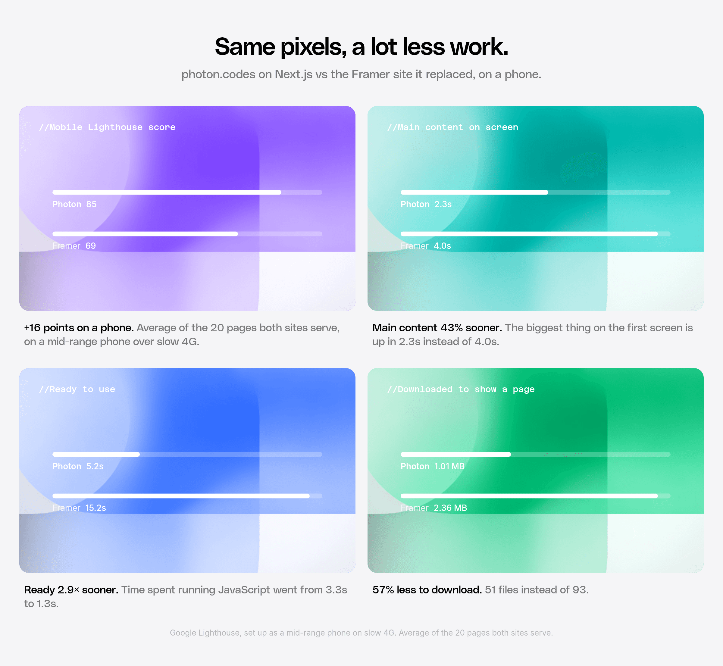
On that phone, a page's main content now shows up in 2.3 seconds instead of 4.0. The page is ready to use in 5.2 seconds instead of 15.2. It downloads about 1 MB to get there, down from 2.36 MB, and spends 62% less time running JavaScript along the way. The average Lighthouse score went from 69 to 85.
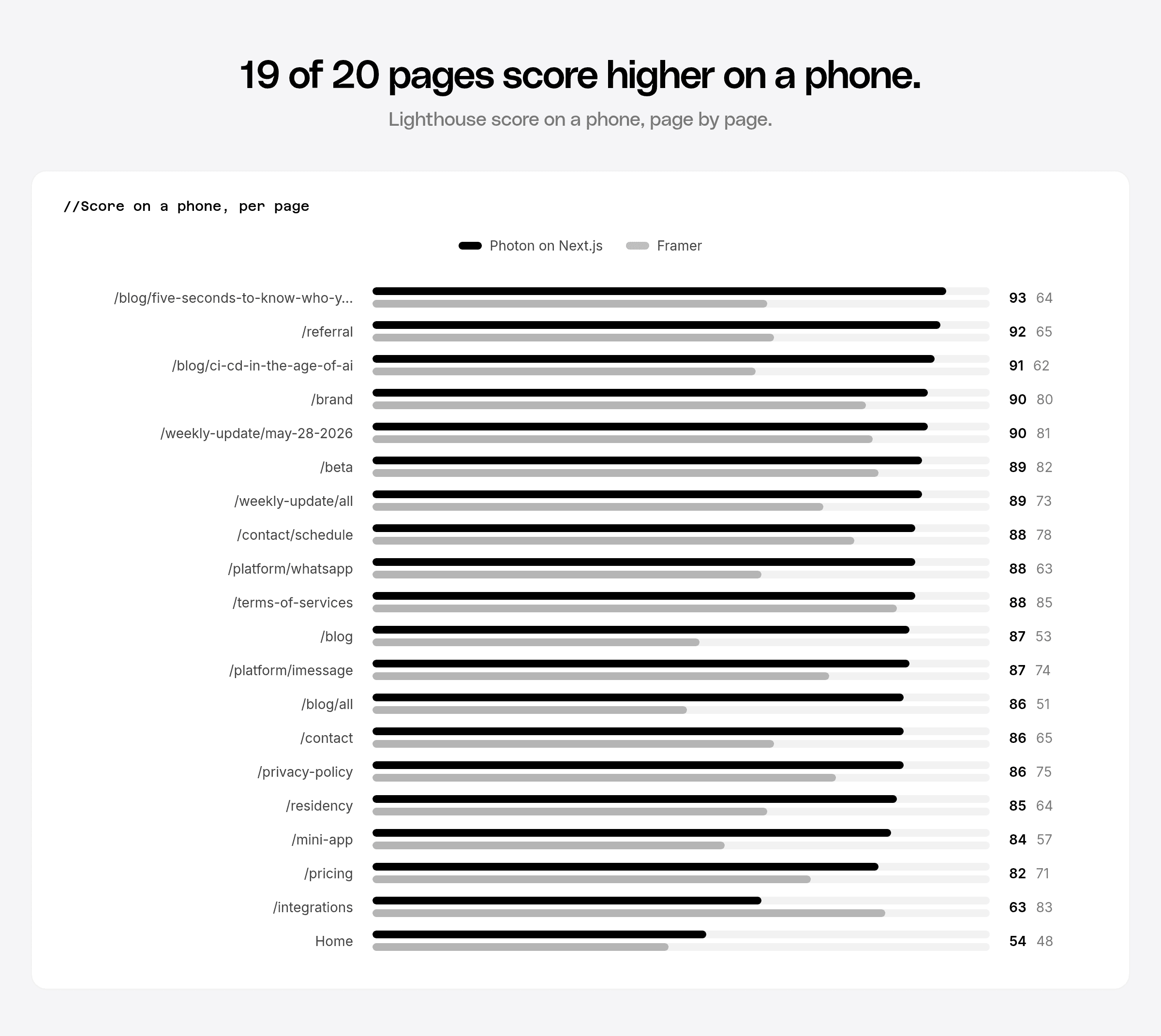
The blog moved the most: the four biggest jumps are all blog pages. The blog index went from 53 to 87, and our post Five Seconds to Know Who You're Texting went from 64 to 93. The residency page has a headline that reveals itself letter by letter; on Framer, that page kept a phone's processor busy for 15.7 seconds. Now it's half a second, and the page scores 85 instead of 64.
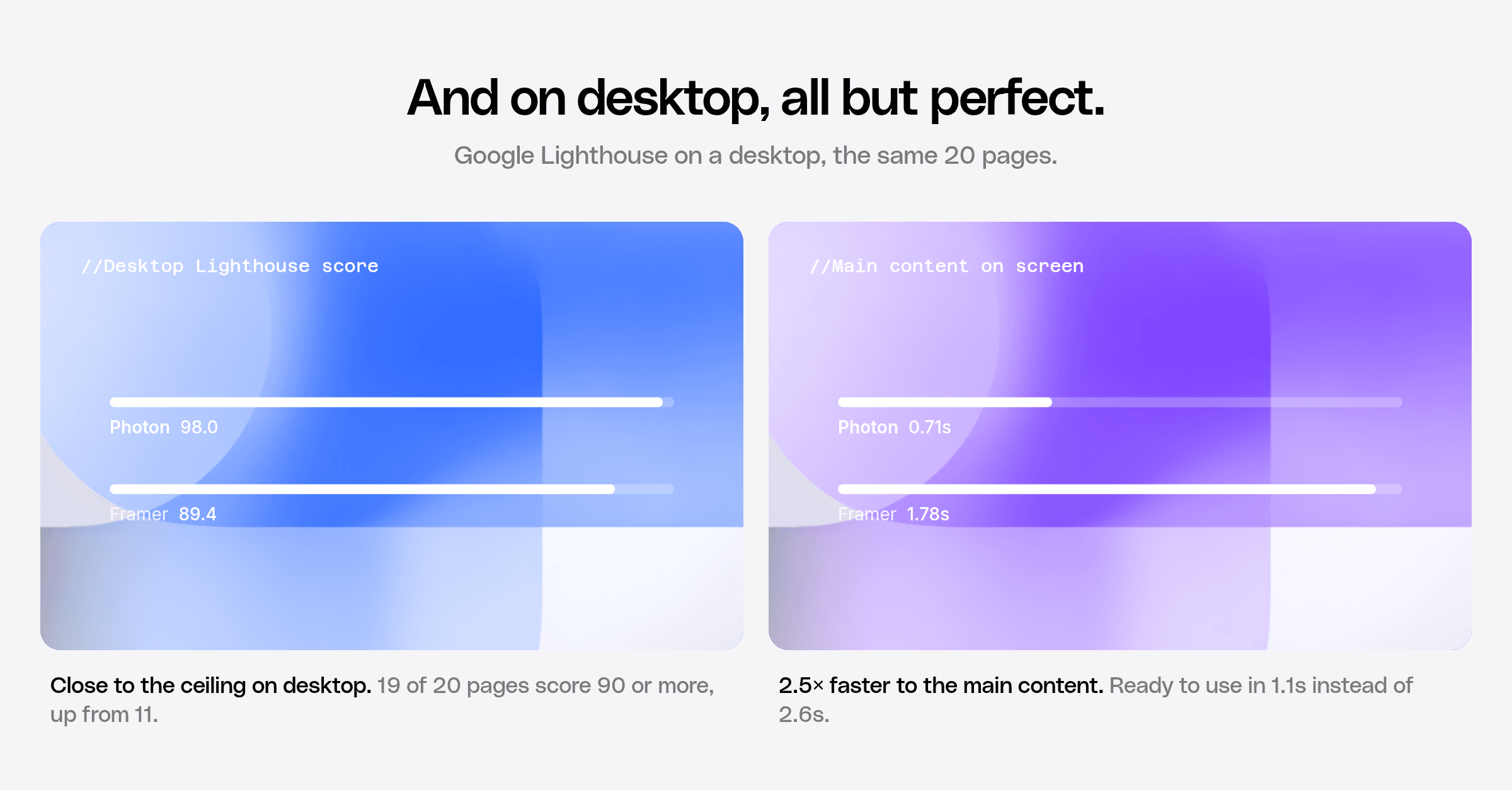
On a desktop the old site already did well, and the new one is close to the ceiling. The average score went from 89 to 98, and 16 of the 20 pages now score 99 or 100. The main content appears in 0.7 seconds instead of 1.8.
Scroll all the way down
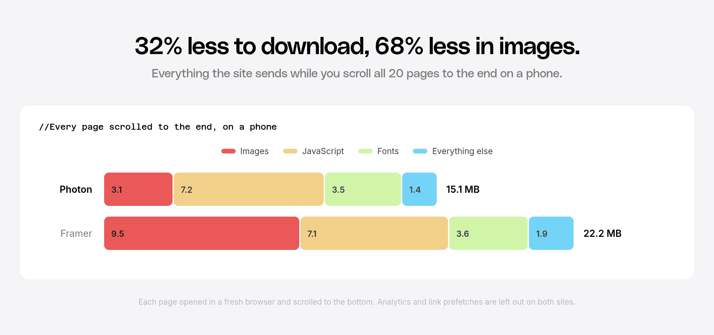
Lighthouse only looks at the first screen. To see the rest, we opened every page in a fresh browser, scrolled to the very bottom, and added up everything the site sent.
Across the 20 pages, a phone now downloads 15.1 MB instead of 22.2 MB, about a third less. Most of that came from images, which dropped from 9.5 MB to 3.1 MB.
How we got there
For every page we asked the same question: what is the visitor downloading or waiting on, and do they need it?
The stair on the home page
The cascade of glass cards at the top of the home page used to be a flipbook: 122 images at 4K resolution, about 14 MB, swapped one after another as you scrolled. It played at around 12 to 15 frames per second.
We redrew it in code. It now renders on the graphics card, matches the original pixel for pixel, and scrolls at 60 frames per second, Safari included.
Pictures that were really shapes
Many of the site's images were gradients and simple shapes saved as pictures. The glass backgrounds behind the feature cards were 11 separate files; now they're one piece of code that takes a color. The security cards, the contact collage, the spectrum bands and the pricing diamonds are drawn in code too, and the pricing illustration went from 244 KB to 22.5 KB.
Photos that stayed photos are resized for each screen and sent as AVIF, a newer image format. Across the site's 204 images, that came out 46% smaller than before, with no difference you can see. The image each page opens with is now the first thing the browser asks for, which brought the main content of the blog and the weekly updates on screen about two seconds sooner on a phone.
Five fonts for five words
The old site set five words, "basemate" and "AgentCard" among them, in fonts used nowhere else. Every visitor downloaded five font files to see five words. We turned those words into drawings, and did the same for the Photon logo, which used to be a character in a font. Each page now loads only the fonts its text uses, and 27 font files that no page used are gone.
Animations the browser runs on its own
On Framer, many animations ran as JavaScript on every frame, which keeps a phone working even while you're only reading. We handed them to the browser's built-in animation engine. The scrolling logo rows run there now, and cards that change on a timer pause when they leave the screen. Entrance animations start the moment the page appears, with the same springs as before. The residency headline used to be about 3,000 scripted animations. Now it's one per letter.
Smaller pages
The home page used to carry every customer logo three times. One shared file replaced the copies, and the home page itself went from 223 KB to 106 KB. Styles now arrive with the page, so text appears without waiting on a second download.
Built on Vercel
We could have hosted the new site anywhere. We picked Vercel because it handled the parts of a project like this that usually slow a team down, and it showed in how fast we could ship.
Every pull request got its own live copy of the site, so every change was checked in a real browser before it merged: 169 previews across 68 branches in the first two weeks. The before-and-after numbers for each fix in this post came from those previews, measured next to production.
Every merge lands on a private staging site first, and production only moves when we promote a release. Rolling back means promoting the one before. In 13 days that added up to 249 deployments, 25 of them to production, and none of them done by hand.
Pages are built ahead of time and served from Vercel's network, close to whoever is visiting. When someone publishes in our CMS, only the pages that changed are rebuilt. Image resizing is built in, so moving the whole site to AVIF was a one-line change. And Speed Insights reports how fast the site is for real visitors, page by page, so this post won't be the last time we look at these numbers.
The dashboard got the same care
The website is where people meet Photon. The Photon 2.0 dashboard is where they work, and we held it to the same bar.
It's rendered on Cloudflare's network close to you, so the page and its loading state show up right away and your data fills in from there. It talks to the API through code generated from the API's published definitions, which keeps the two in step. Your session lives in a cookie that page scripts can't read, and the browser never holds an API key.
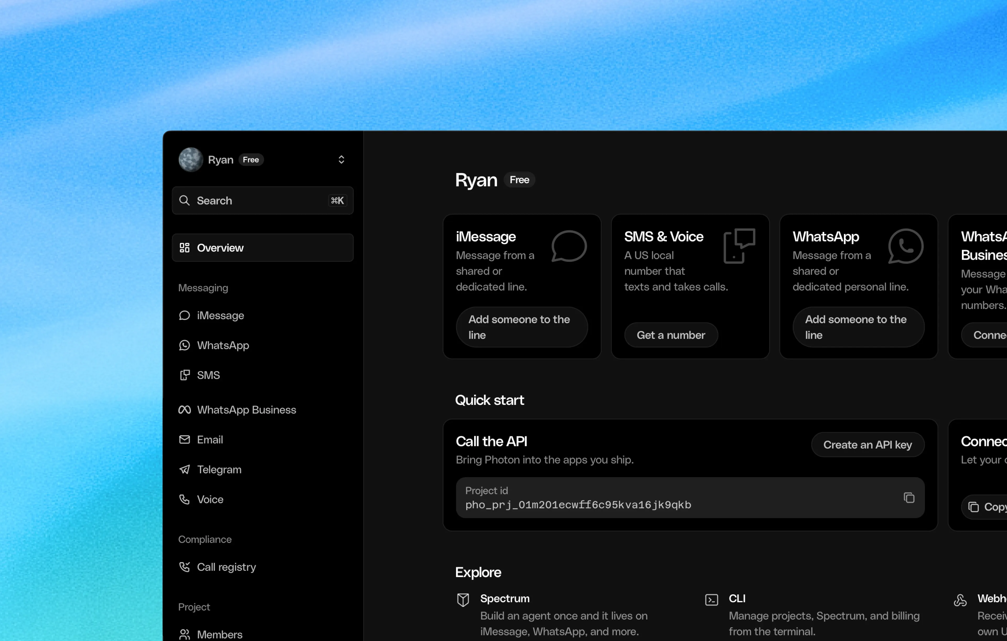
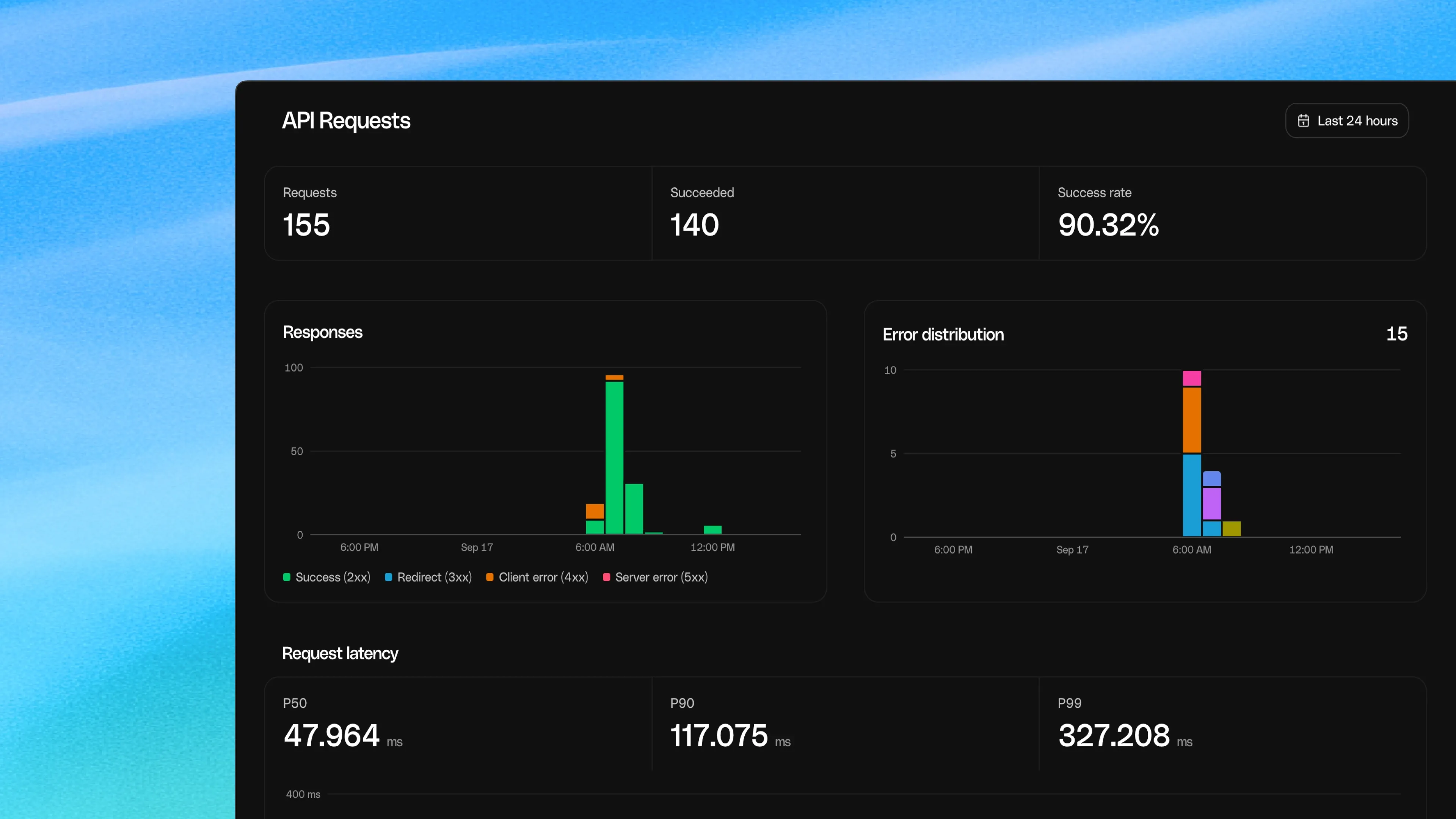
From the line view you can check your Apple Account, service health, SMS relay and calling setup in one place, and follow any message well past the moment the API accepted it.
Built like the rest of Photon
The biggest change is one you can't see. photon.codes used to be the only part of Photon outside our codebase. Now every change to it goes through review and more than 500 automated browser tests on desktop, tablet and phone. Posts like this one live in our own CMS, where we preview them before they go out. Nothing on the site loads from Framer anymore.
What's next
Desktop is at 98. Next we want every page to score 90 or more on a phone too, starting with the home page, the heaviest page on the site.
Photon 2.0 is in public beta, with $100 in free credit to start building: one API for iMessage, WhatsApp Business, Telegram, SMS, RCS, email and voice, and a dashboard that shows you what's happening. We'd love to see what you build with it.
How we measured
We measured the Framer site on October 24, 2026, the last week before the domain moved, and the new site on October 30, 2026, on the same machine with the same tools. Each run started only once the machine was otherwise idle.
The 20 pages are the ones both sites serve: home, /beta, /blog, /blog/all, two blog posts, /brand, /contact, /contact/schedule, /integrations, /mini-app, /platform/imessage, /platform/whatsapp, /pricing, /privacy-policy, /referral, /residency, /terms-of-services, /weekly-update/all and one weekly update.
Lighthouse 12.8.2 ran in headless Chrome. On a phone it simulates a 4× slower processor and a slow 4G connection (150 ms round trip, 1.6 Mbps); we ran each page three times on mobile and once on desktop, took the median, and averaged across pages. Both sites were measured the way visitors get them, analytics included. For the full-page numbers, each page loaded in a fresh browser at 390 px and 1440 px wide and scrolled to the bottom in 500 px steps; analytics and link prefetches are left out on both sites.